The person I spoke to in regards to revisions to my website was my wife. She is a fine art graduate that has an eye for design. I used her feedback primarily as a way to design my site to be more aesthetically pleasing. The first area she suggested I revise was the header/overall navigation of the page. Originally, I had the navigation bar on the left side of the site, but per her suggestion, I moved the navigation into the header. I also made some adjustments to the color choice and other design attributes.

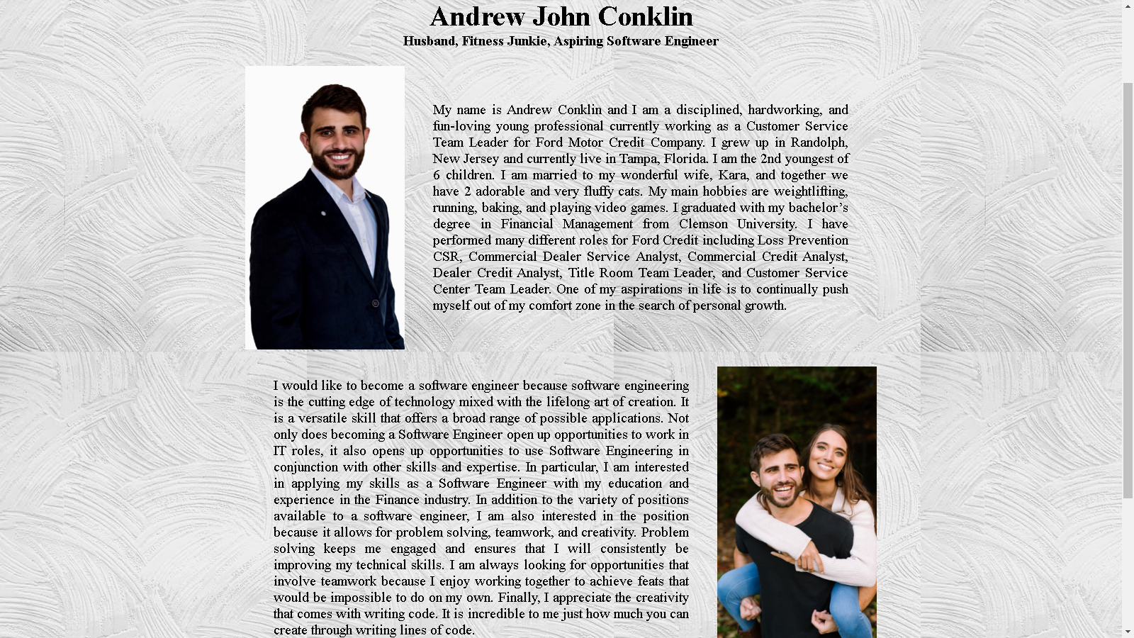
The next page she had suggested that I change was the About Me page. Her feedback was that the original page was unbalanced and did not appreciate that the text was just center aligned. Her feedback was to make it look more editorial and to include another picture to balance out the page. I utilized the flexbox layout on the revision to get familiar with the flexbox layout options.


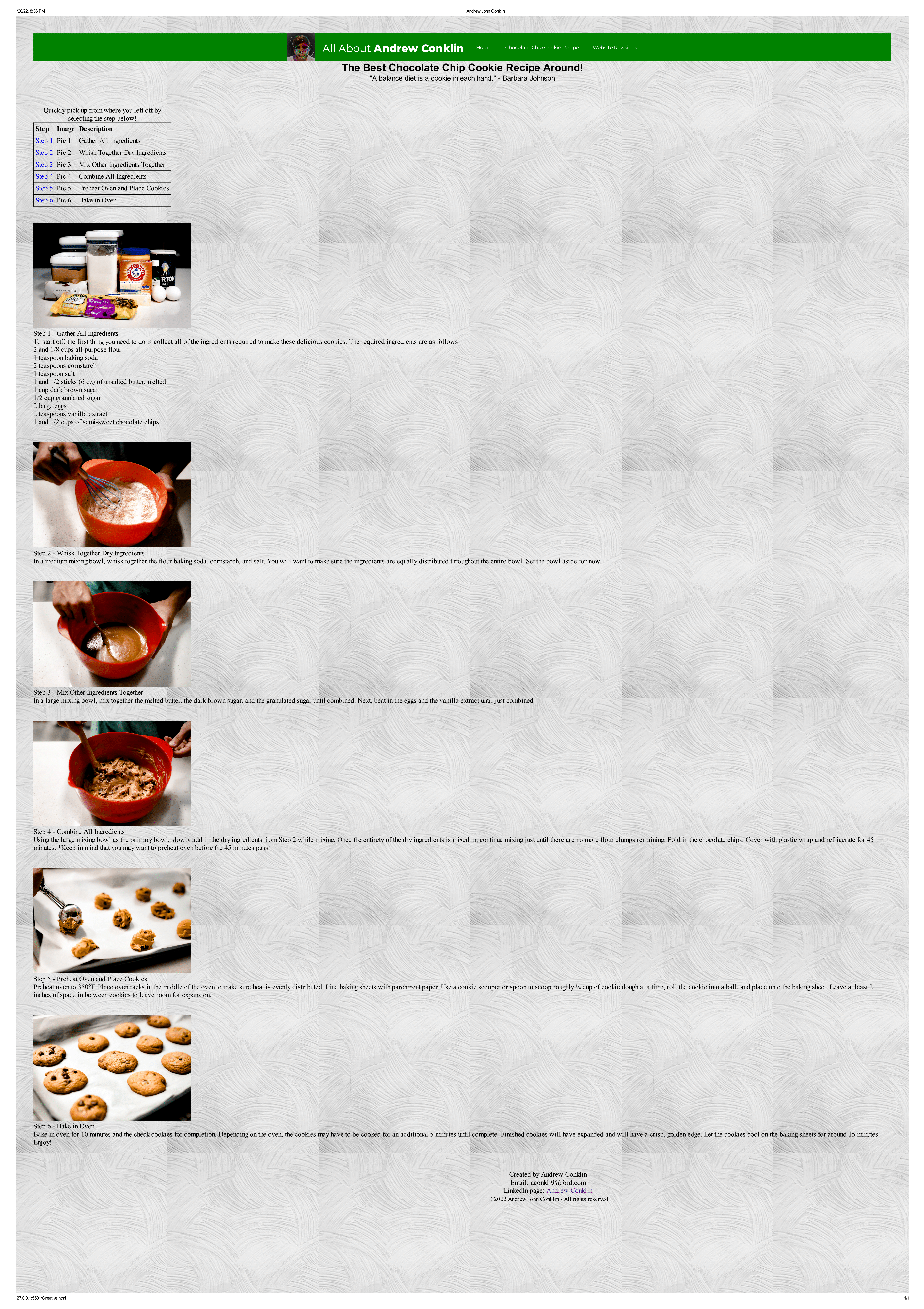
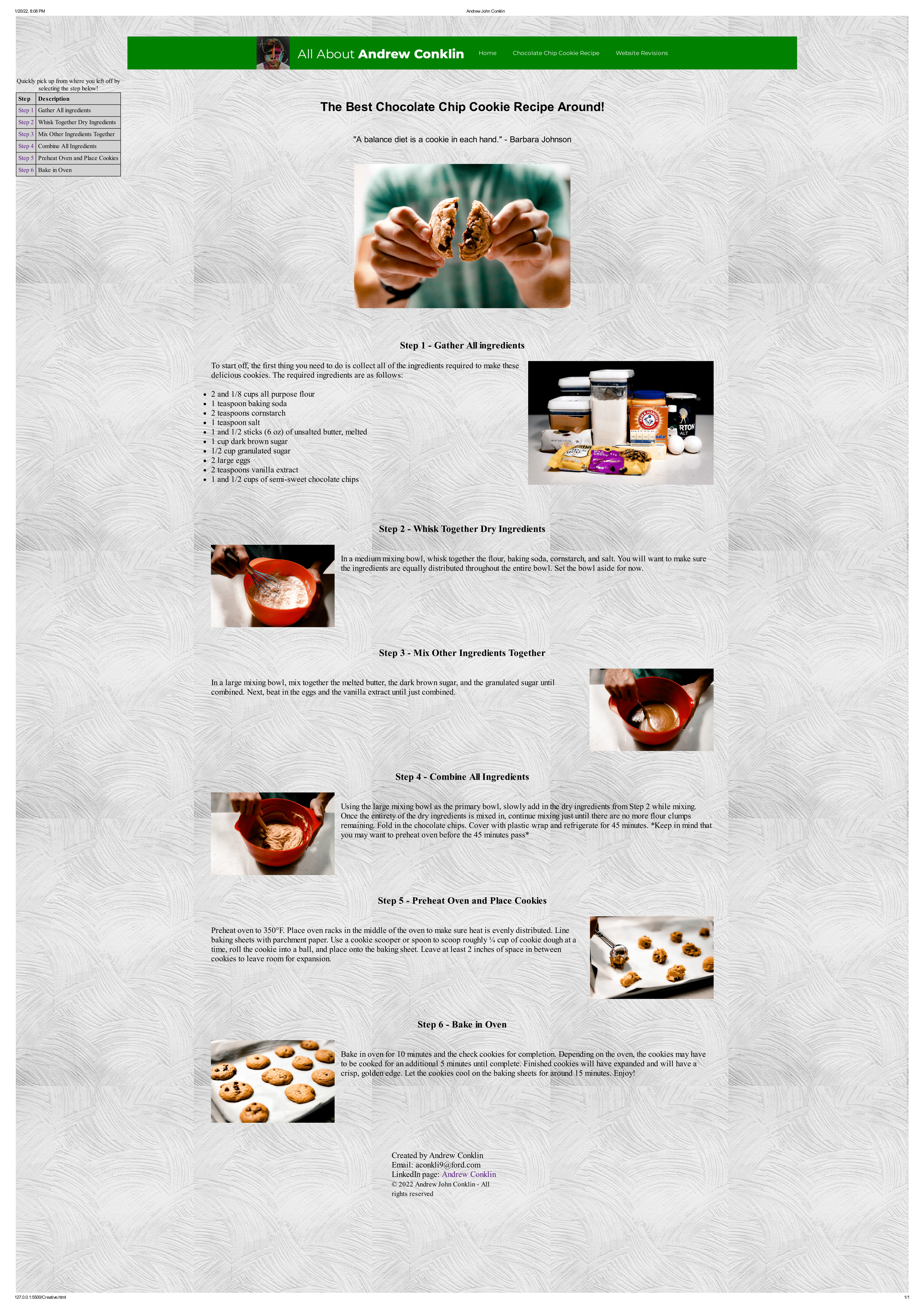
The last and largest revision I made was to the Chocolate Chip Cookie Recipe page. There was a good deal about this page that my wife did not adore. First off, she did not like that the first item on the page was the table. In order to correct that, I added an additional photo of me breaking a cookie in half as the first item. She still was not a fan of the table. I did some online research and found a way to turn that table into a small navigation sidebar. The other critique of this page was that it was too boring, once again not balanced, and that it was hard to tell which step each picture was for. To correct this, I alternated the pictures from right side to left side and had the text for the step right beside it.